Model Section
The Section tabs have the panel divided into: Section and Contour.
Section panel
The Section tab contains the following items:
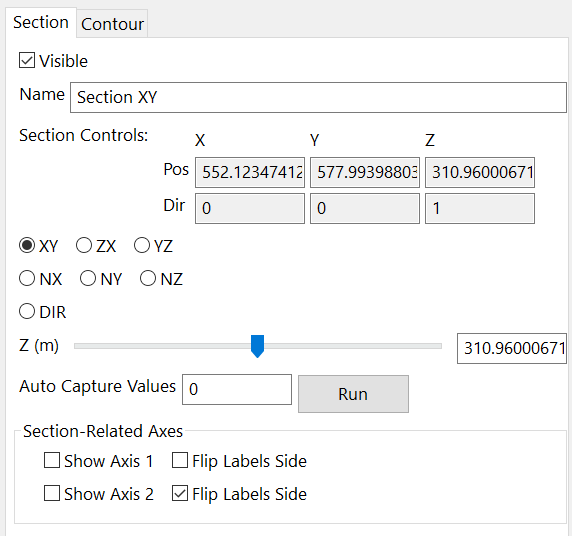
Figure 133 Section panel Tab
Visible
Controls the visibility of the Section;
Name
By default the node name is “Section XY/ZX/YZ”, but it can be changed by entering the desired new name in this box;
Is a not an editable table. It shows the actual information about the Position and the Direction of the object in the 3D scene. It is automatically updated every time the operator clicks on the directional buttons explained below.
XY, XZ, YZ buttons
They allow to set the plane on which to visualize the section, choosing between these three main directions of the 3D space.
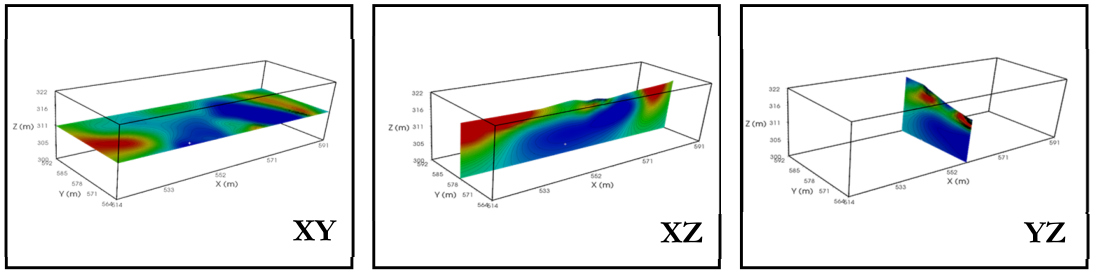
Figure 134 Section in the three main planes
NX, NY, NZ buttons
They allow to rotate the section by an angle N around the X/Y/Z axis. In the following example, the XY Section is tilted 20° around the X axis in one case and 10° around the Y axis in the other.
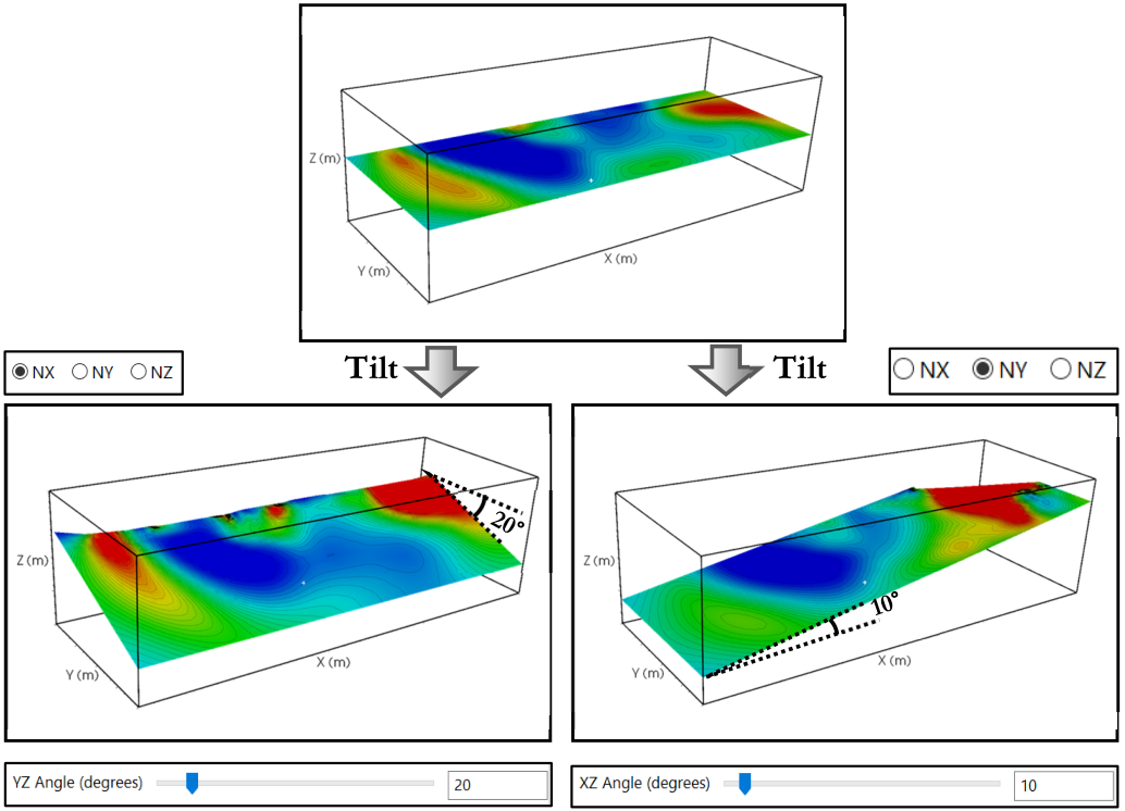
Figure 135 Examples of rotation of XY section
Note
Note that in some cases, during the mesh generation, a rotation can help to minimize the total number of cells. Then, to restoring the original coordinates, an opposite rotation is usually performed. After this it happens that the default sections, parallel to the main axes, can give questionable results. Because this it can be useful to set the NZ option, and to add/substract the rotation amount to the default NZ value, to then get a section that follows the local mesh axis.
DIR button
Allows to move sections in one of the main directions (checking NX, NY or NZ) in the mesh. Moving the slider, or typing the desired number in the number box, will move the section in the mesh until the desired position is reached. Some examples are shown in Figure 136.
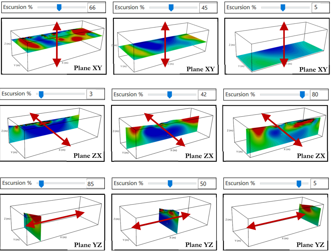
Figure 136 Examples of section translation through the three main directions
Auto Capture Values
Is useful when it is required to capture a lot of screenshots of the sections in the 3D scene from the same point of view of but in different positions. Type the sequence of numbers (one for each position) or using the specific notation (see section Mathematical Notations), as shown in Figure 137.
The numbers to type in the box refers to the label shown before the slider, it is X (m) in this case but it can be an angle (degree) if NX, NY, or NZ is selected.
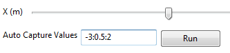
Figure 137 Auto-capture values panel
In this case a series of images will be saved with the sections from positions -3 to position 2, along the X axis, with a step size of 0.5m (11 images throughout).
Clicking on the Run buttons automatically saves the images in the working folder. The same result can be obtained using the “Capture” button at the top of the screen in the 3D scene, but in this case it is necessary to do save every figure individually. Using the “Auto Capture Function” allows to save many images all at once.
Section-Related Axes
This option allows to add a second axis system, applied to the selected section. Check Show Axis 1 to visualize the vertical axis and/or Show Axis 2 to visualize the horizontal axis. If the labels are not readable because they are superimposed on the Section (Figure 138) they can be flipped to the opposite side of the axis line using the Flip Labels box.
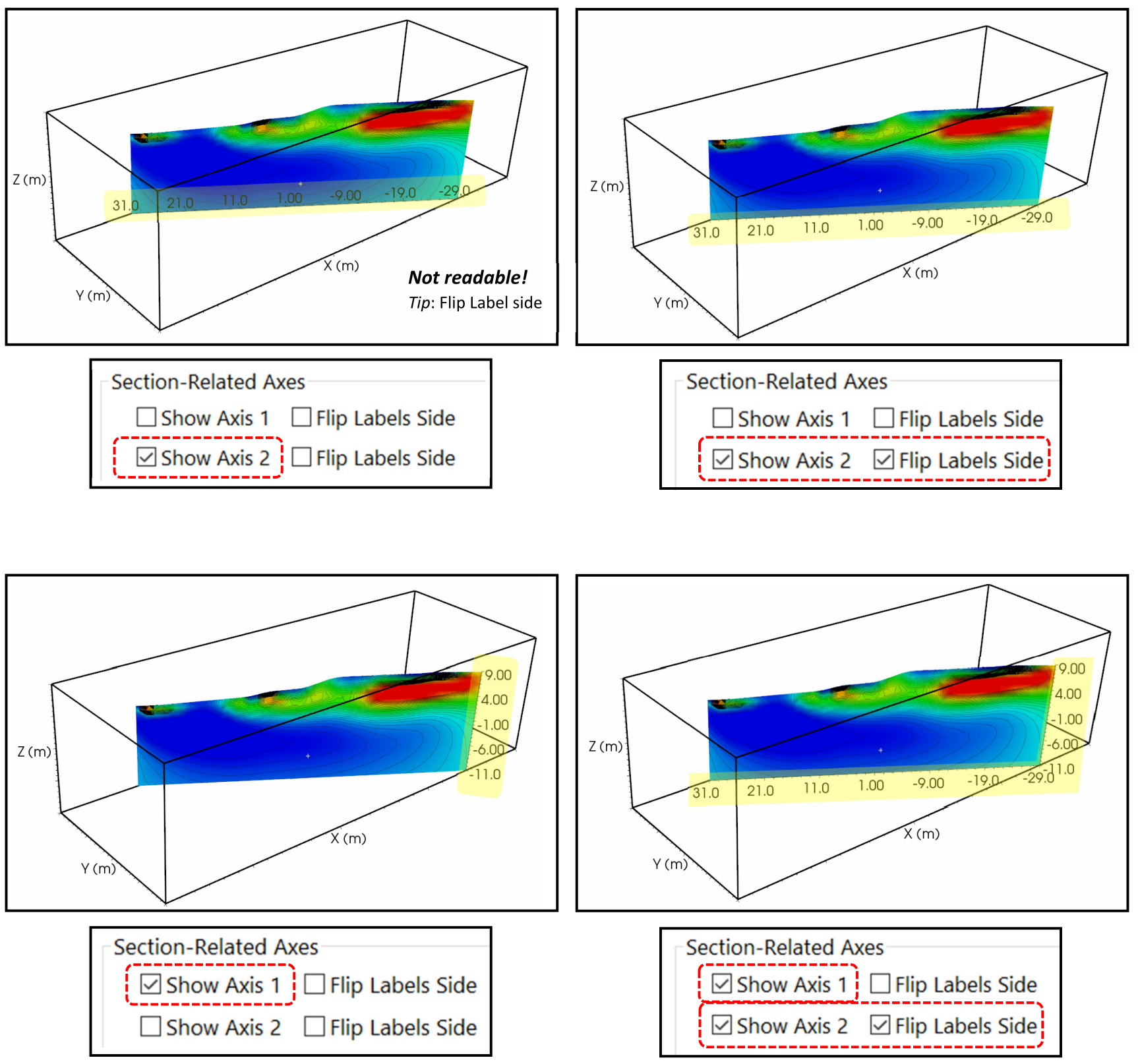
Figure 138 Examples of secondary axes visualization
Contour Panel
The Contour tab contains the following items:
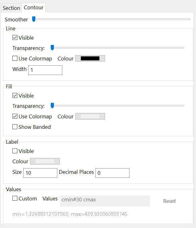
Figure 139 Contour Tab
It is divided into 4 sub-panels: Line, Fill, Label, and Values.
Line
The Line panel has the following options:
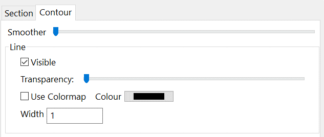
Figure 140 Contour Lines setting
Visible: controls the visibility of the contour lines (Figure 141).
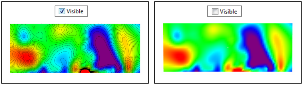
Figure 141 Contour lines visible and not on a XY section
Transparency: manages the transparency level of the lines. When the slider is totally to the left the lines are completely visible, when it is on the right they are not visible and at the intermediate positions they are more transparent as the slider goes towards the right.
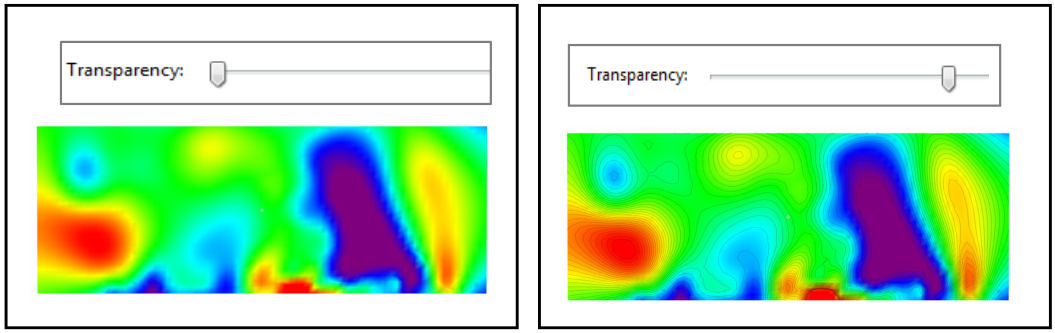
Figure 142 Different level of contour lines transparency
Use Colormap/Colour: if checked the contour lines have the colour of the Colormap. Their colour changes as function of the values. If it is not checked, all the lines have the same colour, set by the apposite button (it is dark grey by default).
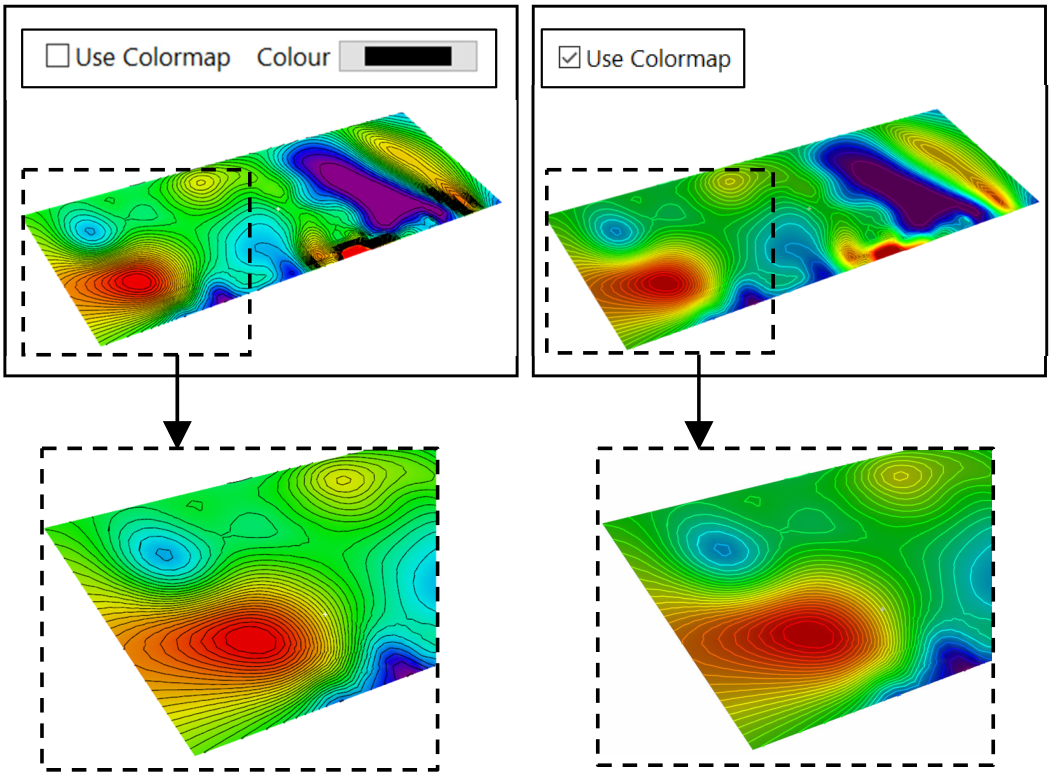
Figure 143 Example of one colour (black) and colormap contour lines
Width: set the width of the colour lines, typing a number from 1 to 20 in the box.
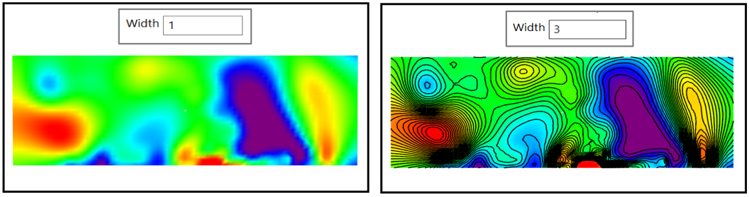
Figure 144 Example of different contour lines width
Smoother: smooths the appearance of the contour lines in case they are not round shape enough.
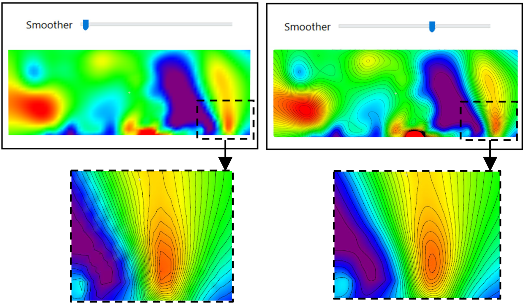
Figure 145 Example of contour lines smoothing
Fill
The Fill panel has the following options:
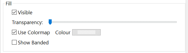
Figure 146 Contour Fill setting
Visible: controls the visibility of the contour lines. They are normally coloured in every point. If Visible Line is selected, it displays the section with the contouring lines overlaid. If it is not checked, only the contouring lines are visible (Figure 147).
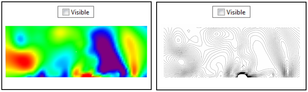
Figure 147 XY section with and without the filling visible
Transparency: manages the transparency level of the filling (Figure 148).
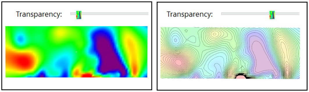
Figure 148 Different level of filling transparency
Use Colormap/Colour: if checked the filling has the colour of the Colormap. It changes as function of the resistivity values. If not checked the area has the same colour, set by the button nearby (it is dark grey by default). In Figure 149 on the right the contour lines follow the colourmap.
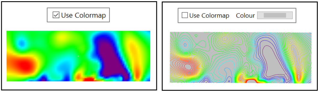
Figure 149 Example of one colour (grey) and colormap filling
Show Banded: if checked the filling is banded when it goes from one value to another. If unchecked the transition from one colour to another is nuanced. The difference between the two ways to represent data is more evident if the contour lines are not visible.
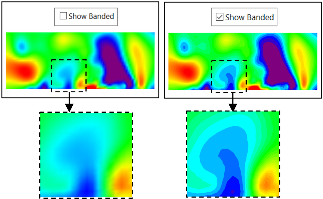
Figure 150 Filling of XY section with banded visualization mode active and not
Label
The Label panel has the following options:
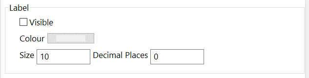
Figure 151 Contour Label setting
Visible: controls the visibility of the contour lines labels.
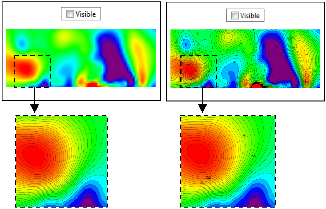
Figure 152 Filling of XY section with and without lines labels visible
Colour: set the colour of the contour lines labels through. It is grey by default. In the following example it is changed from black to white.
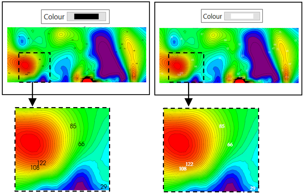
Figure 153 Example of lines labels of different colours
Size: set the size of the contour lines labels, writing a number from 1 to 50 in the number box. In the following example it is set at 10 and 20.
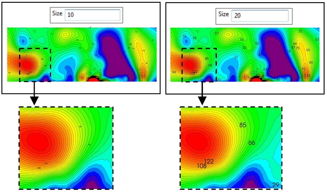
Figure 154 Example of lines labels of different sizes
Decimal Places: set the number of contour lines decimals. It is set to 0 by default, but it can be changed by typing a number from 1 to 50 in the number box. In the following example it is set to 1 and 2.
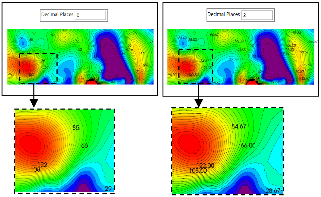
Figure 155 Example of lines labels with different decimal places
Values
The Values panel has the following options:
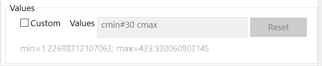
Figure 156 Contour Values setting
Here the maximum and minimum values to apply to the contouring lines and the step interval from one line and the next can be selected. Below the text box the minimum and maximum values of the entire dataset are reported.
Custom: if not checked the optimal values are automatically calculated. If checked the text box is activated.
Values box: type the desired number of contour lines to display in the text box. Type the sequence of numbers or use one of the mathematical notations described in Mathematical Notations. One of the correct ways to write the numbers is: Minimum value to represent: Step : Maximum value to represent
In Figure 157 values from 5 to 150, with step 10 and 20 have been chosen for visualization.
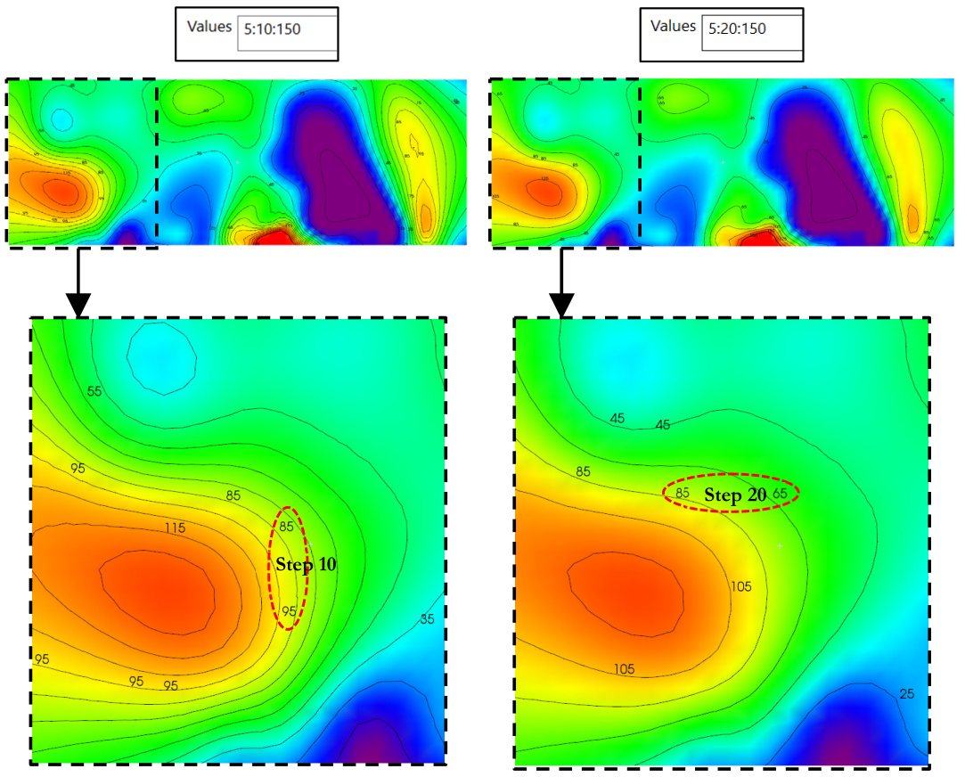
Figure 157 Example of different step value between contour lines